library(dplyr)
library(ggplot2)
library(plotly)
library(tidyr)
library(knitr)
Tip
Plots will be images or interactive plots.
Note: images can be clicked on to zoom in on the plot itself
Have fun! :)
Data Exploration on Soccer Players
Load the relevant libraries
Let’s look at the dataset first
players_2024 <- read.csv("../../../../data/Players2024.csv") ……..Loading data……..
What type of data exists in our dataset?
| Headers |
|---|
| name |
| birth_date |
| height_cm |
| positions |
| nationality |
| age |
| club |
\(\boldsymbol{Peak\text{ } at \text{ } data}\)
| name | birth_date | height_cm | positions | nationality | age | club |
|---|---|---|---|---|---|---|
| James Milner | 1986-01-04 | 175 | Midfield | England | 38 | Brighton and Hove Albion Football Club |
| Anastasios Tsokanis | 1991-05-02 | 176 | Midfield | Greece | 33 | Volou Neos Podosferikos Syllogos |
| Jonas Hofmann | 1992-07-14 | 176 | Midfield | Germany | 32 | Bayer 04 Leverkusen Fußball |
| Pepe Reina | 1982-08-31 | 188 | Goalkeeper | Spain | 42 | Calcio Como |
| Lionel Carole | 1991-04-12 | 180 | Defender | France | 33 | Kayserispor Kulübü |
| Ludovic Butelle | 1983-04-03 | 188 | Goalkeeper | France | 41 | Stade de Reims |
\(\boldsymbol{Summary\text{ } of \text{ } data}\)
| name | birth_date | height_cm | positions | nationality | age | club | |
|---|---|---|---|---|---|---|---|
| Length:5935 | Length:5935 | Min. : 17 | Length:5935 | Length:5935 | Min. :15.0 | Length:5935 | |
| Class :character | Class :character | 1st Qu.:178 | Class :character | Class :character | 1st Qu.:22.0 | Class :character | |
| Mode :character | Mode :character | Median :183 | Mode :character | Mode :character | Median :25.0 | Mode :character | |
| Mean :183 | Mean :25.5 | ||||||
| 3rd Qu.:188 | 3rd Qu.:29.0 | ||||||
| Max. :206 | Max. :42.0 |
Issues with dataset
Caution
Visualising height_cm against positions shows issues with dataset
Show code
# Standard box plots (error with missing)
ggplot(players_2024,
       aes(x = positions,
           y = height_cm)) +
  geom_boxplot()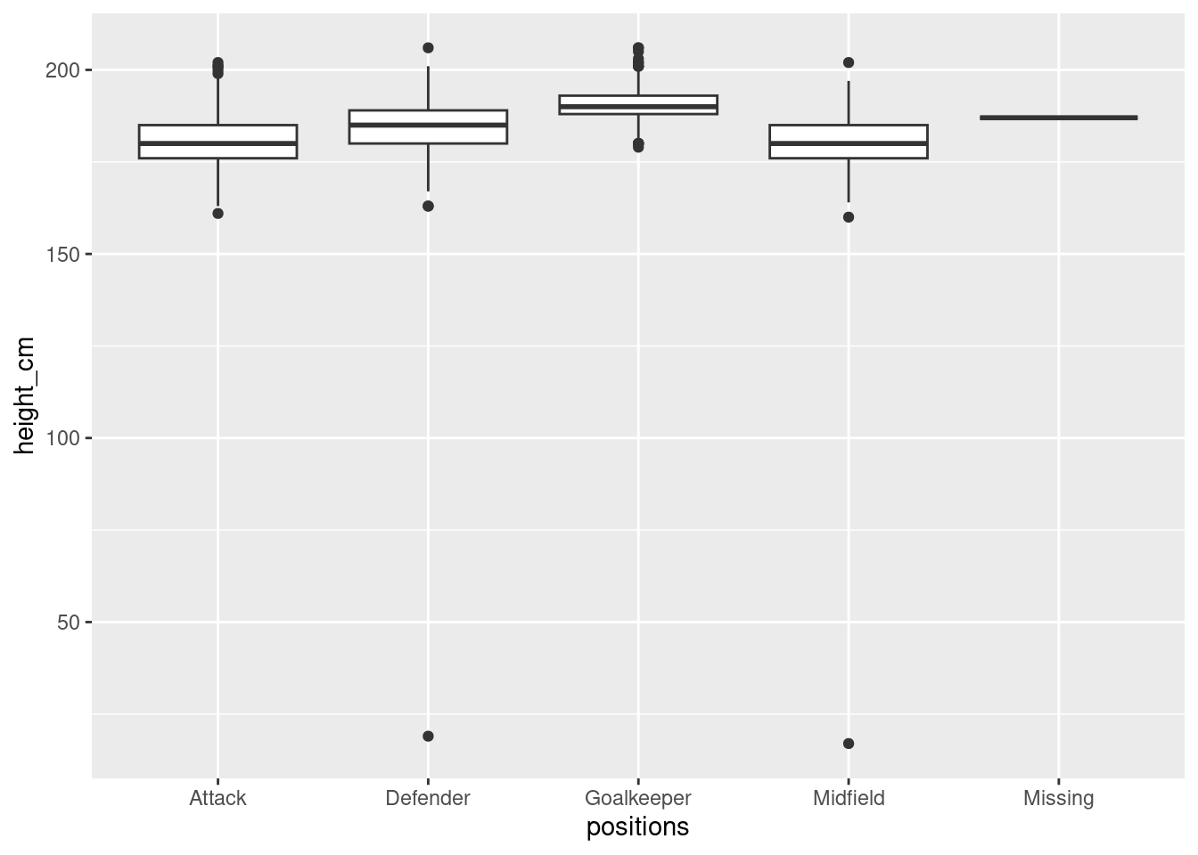
Fix the dataset
Here we will filter out “bad” values
players <-  players_2024 %>%
  filter(positions != "Missing", height_cm > 100)
Note
NOTE: this is a specific filter command for our case,
it is common to check for na, blank etc etc.
Always check your dataset or adopt good practices when making dataset(csv).
Distribution of height (and age) among different positions
Basic Box plot
We first look at distribution of the height of players across different positions.
Show code
# Boxplot with fixed dataset
p1 <- ggplot(players,
         aes(x = positions,
             y = height_cm)) +
    geom_boxplot()
ggplotly(p1)
Tip
First Interactive Plot!!!
Interact with the plot to get IQR information about plots
Violin Plot
We fancify the basic box plot by surrounding the box plot with a violin plot
Show code
# plot simple violin plot
ggplot(players,
         aes(x = positions,
             y = height_cm)) +
    geom_violin(aes(fill=positions))+
    geom_boxplot(width=0.1)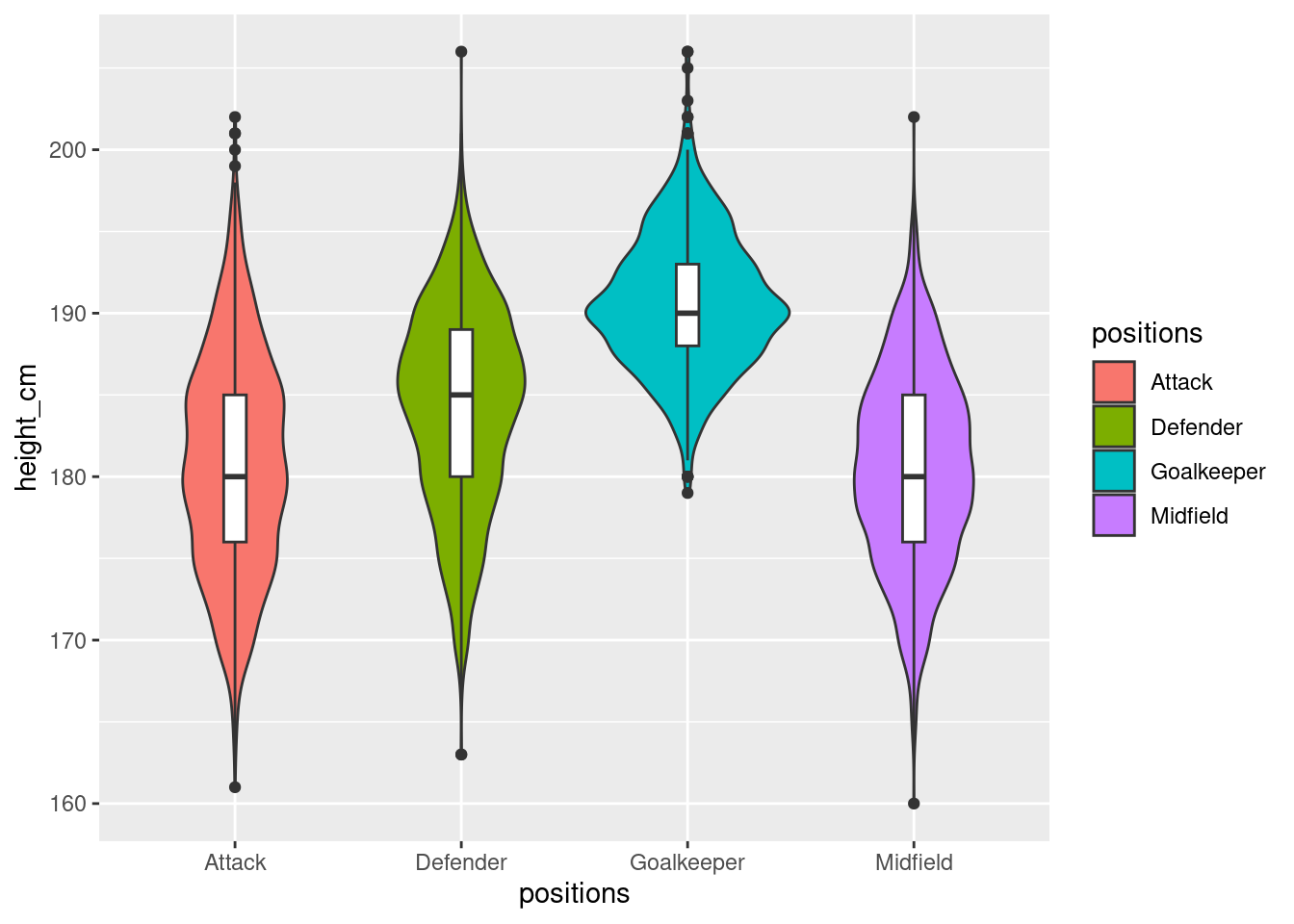
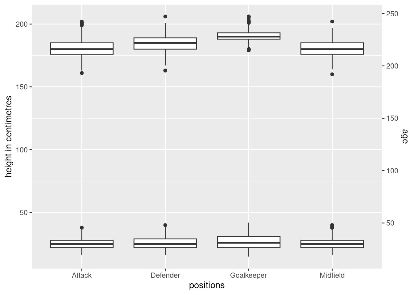
Adding age as another variable
What if we just added the age in as another box plot (layered box plot). While this will tell us the distribution as well, it is rather unappealing and the box plots are squeezed as a result of the unnecessarily long scales.
Show code
# Include all
ggplot(players,
       aes(x = positions,
           y = height_cm)) +
  geom_boxplot() +
  geom_boxplot(
    mapping = aes(y = age), data=players
  ) +
  scale_y_continuous(
    "height in centimetres",
    sec.axis = sec_axis(~ . * 1.20, name = "age")
  )
Overlapping layers
What if we added age points surrounding the box-plot to get the distribution of ages. It is rather messy because there is far too much (age) data for the same heights
Show code
#Can i inform the audience about age?
ggplot(players,
       aes(x = positions,
           y = height_cm)) +
  geom_jitter(aes(colour=age))+
  geom_boxplot(width=0.1)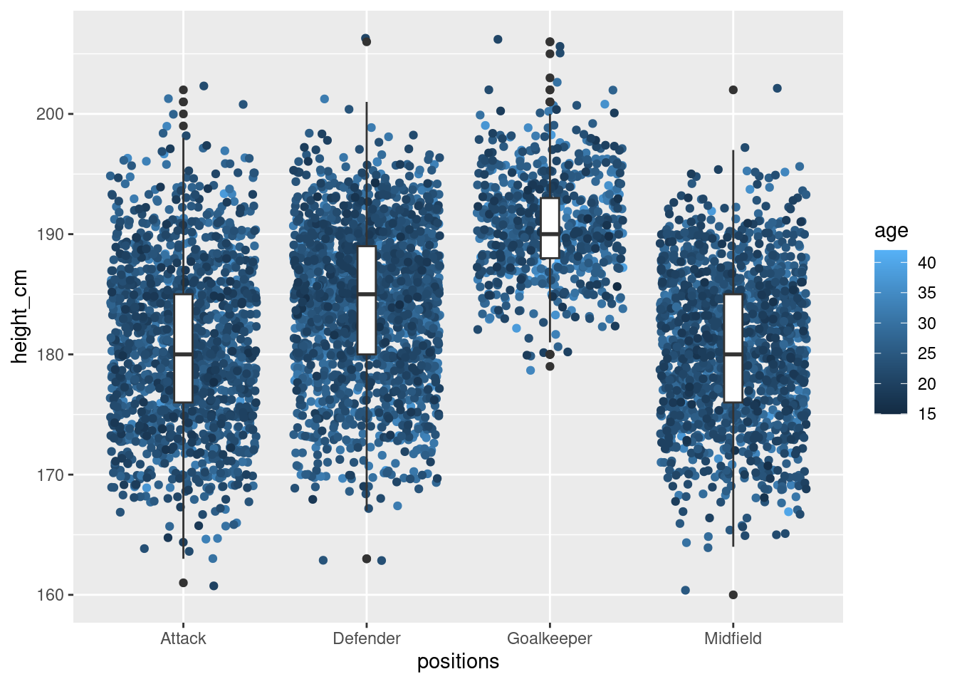
NoteSidenote
NOTE: I did attempt to add a distribution around the violin plot
with color gradient but it seems to more difficult that i thought
because the violin plot does not show data points but a distribution.
There are some stack overflow discussion on gradient colors in violin plots
but they are more complicated than a few hours debugging.
(Somewhat) Informative layer plot
Instead of plotting age as it is, let’s get the average age per height.
Lets check if it is sensible to do so.
#Collect for each position, the heights and find the average age per height
#for each positions
height_age <- players %>%
  group_by(height_cm,positions) %>%
  arrange(desc(age)) %>%
  summarise(mean_age=mean(age),
            n = n())
……..Collecting data……..
\(\boldsymbol{Peak\text{ } at \text{ } data}\)
| height_cm | positions | mean_age | n |
|---|---|---|---|
| 160 | Midfield | 25.00000 | 1 |
| 161 | Attack | 20.00000 | 1 |
| 163 | Attack | 30.00000 | 1 |
| 163 | Defender | 23.50000 | 2 |
| 164 | Attack | 21.33333 | 3 |
| 164 | Midfield | 28.50000 | 2 |
\(\boldsymbol{Summary \text{ } of \text{ } filtered \text{ } data}\)
| height_cm | positions | mean_age | n | |
|---|---|---|---|---|
| Min. :160.0 | Length:141 | Min. :20.00 | Min. : 1.00 | |
| 1st Qu.:175.0 | Class :character | 1st Qu.:24.66 | 1st Qu.: 6.00 | |
| Median :185.0 | Mode :character | Median :25.36 | Median : 34.00 | |
| Mean :184.1 | Mean :25.61 | Mean : 42.07 | ||
| 3rd Qu.:193.0 | 3rd Qu.:26.22 | 3rd Qu.: 65.00 | ||
| Max. :206.0 | Max. :34.00 | Max. :166.00 |
\(\boldsymbol{Interactive \text{ } Plot \text{ } of \text{ } mean\_age \text{ } against \text{ } height \text{ } with \text{ } count \text{ } of \text{ } players \text{ } given}\)
- Red: more than 100 players
- Orange: more than 10 but less than 99
- Grey: less than 10
- Number labels: Number of players of the same height
Show code
#feel of data
p2 <- ggplot(height_age,
          aes(x = height_cm,
              y = mean_age)) +
  geom_point()+
  geom_point(data = subset(height_age, n >= 100), color = "red")+
  geom_point(data = subset(height_age,  n>= 10 & n <= 99), color = "orange")+
  geom_point(data = subset(height_age, n>=0 & n <=9), color = "grey")+
  geom_text(aes(label = n), vjust = 1.2, size = 3)
ggplotly(p2)
We bring the violin plot (with the box plot within) back and
now add the mean age as coloured points
Show code
# Violin plot with box plot
ggplot(players,
       aes(x = positions,
           y = height_cm)) +
  geom_violin()+
  geom_boxplot(width=0.2)+
  geom_point(
    data= height_age,
    aes(x = positions, y = height_cm, colour =mean_age),
    size = 4
  ) +
  scale_colour_viridis_c(option = "plasma")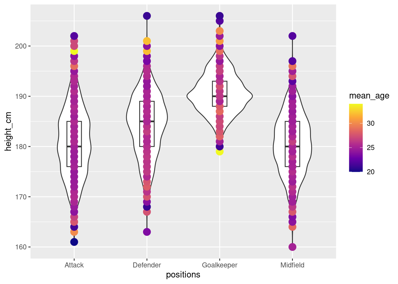
Area for improvement: Ideally, we can achieve a violin plot with colour gradient
of the mean age instead of coloured points.🙃
Heat map
Let’s drop the whole box or violin plots. What about a heat map?
Simple heat maps
We could just plot a simple heatmap of height against age where positions
are shown in colours. However, positions are overlapping themselves.
Show code
# Instead of a violin plot and keeping positions as "1 axis",
# what about a heatmap
#Ugly heatmap
ggplot(players,
       aes(x = age,
           y = height_cm)) +
  geom_tile(aes(fill=positions),alpha=0.5)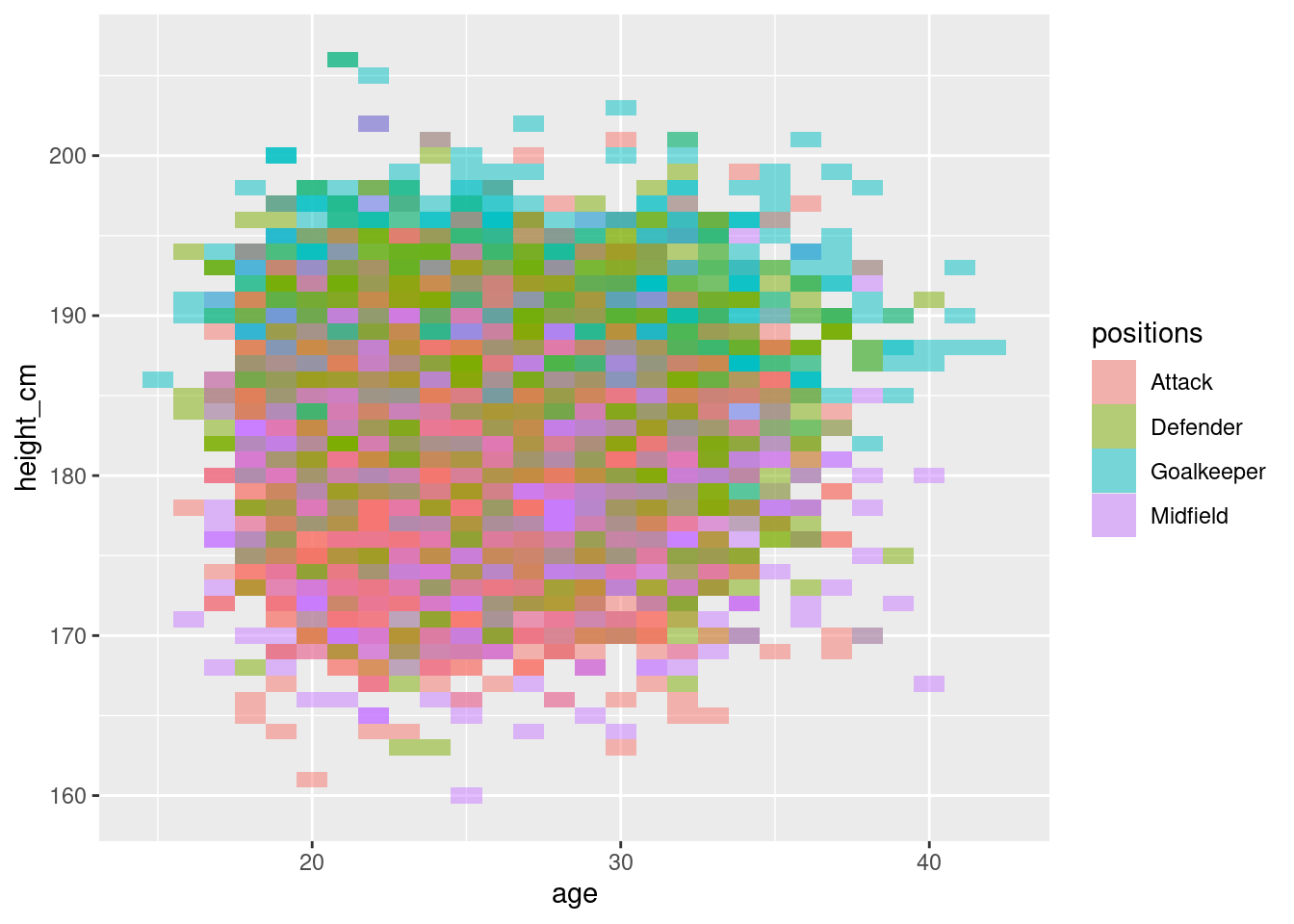
Instead, we separate out the heatmaps into the individual positions. While this is more informative, the colours struggle to exactly show the distribution.
Show code
#Separated but ugly heatmap (no need show)
ggplot(players,
          aes(x = age,
              y = height_cm)) +
  geom_tile(aes(fill=positions),alpha=0.7) +
  facet_wrap(vars(positions))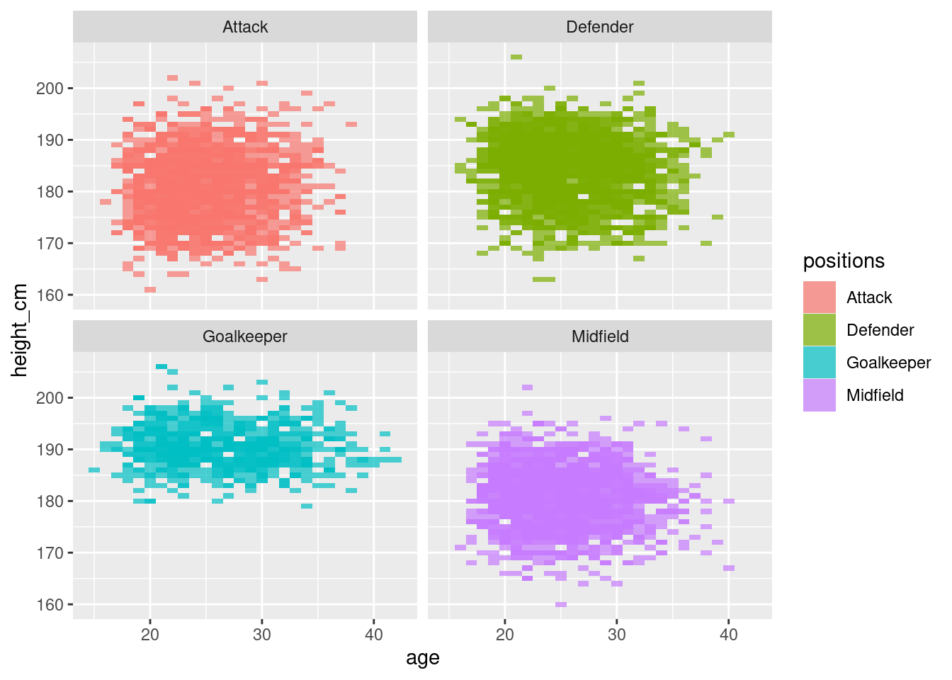
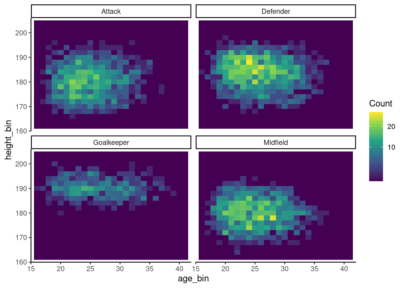
More informative heatmap
Since positions is already relayed by the separation of the heatmaps, we can
instead keep the same colour scheme for the distribution,
We then get this more informative map of distribution of height against age
Show code
# Decent heat map that shows concentration of points
ggplot(players, aes(x = age, y = height_cm)) +
  geom_bin2d(aes(fill = after_stat(count)), binwidth = c(1, 2)) +  # 1-year x 2-cm bins
  facet_wrap(vars(positions))+
  scale_fill_viridis_c(trans = "sqrt", name = "Count")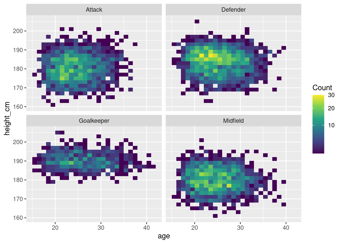
Visually appealing heatmap
Hate the “0” data around the original data?
Fill up the 0s around the original data and get yourselves a more appealing
heatmap 🤗
Distribution of names with special characters across countries
We played around with positions, age, height.
What about other data in the dataset?
Could we do something with name and nationality?
World map
Some names of our players have special characters outside of the 26 characters (A-Z)
What if we looked at the distribution of players that have special characters
in their names?
players_non_english <- players %>%
    filter(grepl("[^A-Za-z '\\-]", name))
……..Extracting data……..
\(\boldsymbol{Peak\text{ } at \text{ } data}\)
| name | birth_date | height_cm | positions | nationality | age | club |
|---|---|---|---|---|---|---|
| Raúl Albiol | 1985-09-04 | 190 | Defender | Spain | 39 | Villarreal Club de Fútbol S.A.D. |
| Jesús Navas | 1985-11-21 | 170 | Defender | Spain | 38 | Sevilla Fútbol Club S.A.D. |
| Rúben Fernandes | 1986-05-06 | 187 | Defender | Portugal | 38 | Gil Vicente Futebol Clube |
| Iván Cuéllar | 1984-05-27 | 187 | Goalkeeper | Spain | 40 | Real Club Deportivo Mallorca S.A.D. |
| João Moutinho | 1986-09-08 | 170 | Midfield | Portugal | 38 | Sporting Clube de Braga |
……..Collecting data as needed……..
#Taken from exemplar
players_cty <- players_non_english %>%
  mutate(nationality = case_match(nationality,
                                  "England" ~ "United Kingdom",
                                  "Türkiye" ~ "Turkey",
                                  "Cote d'Ivoire" ~ "Ivory Coast",
                                  "Northern Ireland" ~ "United Kingdom",
                                  "Wales" ~ "United Kingdom",
                                  .default = nationality))

# Make the country count
countries <- players_cty %>%
  group_by(nationality) %>%
  summarise(n = n()) %>%
  arrange(desc(n))
ImportantCREDIT
This part of the work (plotting world map) was adapted from exemplar for our data
\(\boldsymbol{Peak\text{ } at \text{ } data}\)
| nationality | n |
|---|---|
| Spain | 219 |
| Turkey | 212 |
| Portugal | 90 |
| France | 89 |
| Argentina | 56 |
| Germany | 46 |
| Denmark | 29 |
| Ivory Coast | 20 |
| Colombia | 19 |
| Brazil | 18 |
| Serbia | 17 |
| Belgium | 16 |
| Uruguay | 16 |
| Iceland | 14 |
| Mali | 13 |
| Norway | 13 |
| Hungary | 12 |
| Netherlands | 12 |
| Italy | 11 |
| Venezuela | 11 |
\(\boldsymbol{World\text{ } map \text{ } distribution}\)
Show code
# World map plots
countries %>%
  plot_ly(type = "choropleth",
          locations = countries$nationality,
          locationmode = "country names",
          z = countries$n) %>%
  colorbar(title = "# of Players")