---
title: Gapminder data set analysis
author: Vava, Namitha, Renna
date: 2026-02-05
# The following are optional but recommended
warning: false
format:
html:
code-fold: true
code-summary: "Show code"
code-tools: true
categories: [Python, 26Summer, "data: gapminder.csv"]
---
## Introduction
This presentation explores how GDP per capita relates to life expectancy across countries, revealing patterns that connect economic strength with public well‑being. By comparing these two indicators, we can see which nations convert economic growth into longer, healthier lives, and which ones lag behind. These insights help us understand global development gaps and identify opportunities for more inclusive progress.
First, let's have a brief look into the data
```{python}
#| code-fold: true
import pandas as pd
import seaborn as sns
import matplotlib.pyplot as plt
import country_converter as coco
import plotly.express as px
import scipy.stats as stats

#read the data as df
df = pd.read_csv('../../../../data/gapminder.csv')
df.head()
```
## World population
Now, let's have a look into the world population in 1952-2007
```{python}
#| code-fold: true
# Covert Code ISO Alpha-3
cc = coco.CountryConverter()
df['iso_alpha'] = cc.convert(names=df['country'], to='iso3')

# Make world map with Plotly
px.choropleth(
    data_frame=df,
    locations='iso_alpha',
    color='pop',
    hover_name='country',
    animation_frame='year',
    color_continuous_scale='Magma',
    title='Population'
)
```
## Gross domestic product (GDP) per capita
Next, let's have a look into the GDP
```{python}
#| code-fold: true
#| echo: true
df1 = (
    df.groupby(['year', 'continent'])['gdpPercap']
      .mean()
      .reset_index()
)

df1['rank'] = (
    df1
    .groupby('year')['gdpPercap']
    .rank(ascending=False)
    .astype(int)
)

fig = px.bar(
    df1,
    x="gdpPercap",
    y="continent",
    color="gdpPercap",
    animation_frame="year",
    animation_group="continent",
    orientation="h",
    title="GDP per Capita Ranking by Continents",
    labels={"gdpPercap": "GDP per Capita"},
)

fig.show()
```
```{python}
#| code-fold: true
#| echo: true
# GDP Map
#convert country name
cc = coco.CountryConverter()
df['iso_alpha'] = cc.convert(names=df['country'], to='iso3')

# Make GDP Map
fig = px.choropleth(
    data_frame=df,
    locations='iso_alpha',
    color='gdpPercap',
    hover_name='country',
    animation_frame='year',
    color_continuous_scale='Magma',
    title='GDP per Capita'
)
fig.show()
```
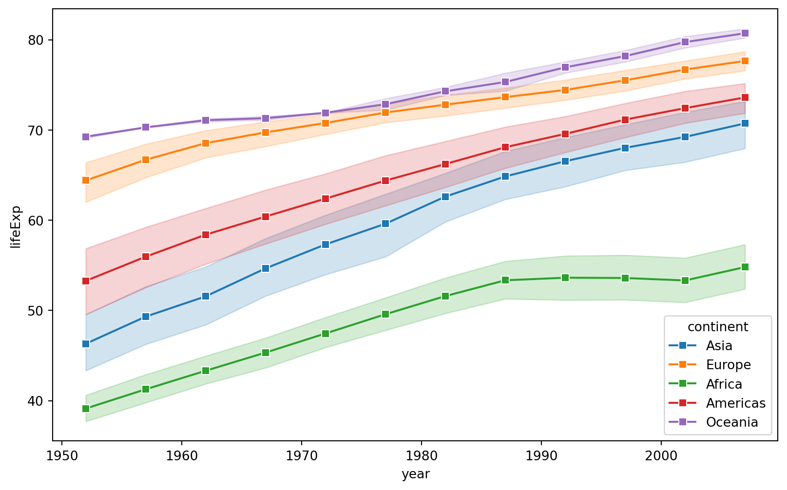
## Life expectancy
We'll inspect people's life expectancy
``` {python}
#| code-fold: true
#| echo: true
#| fig-cap: "Life expectancy per continent"
plt.figure(figsize=(10, 6))
sns.lineplot(
    data=df,
    x='year',
    y='lifeExp',
    hue='continent',
    marker='s'
)
plt.savefig("python_tb-VavaGapminder.png")
```
```{python}
#| code-fold: true
#| echo: true
#LifeExp map
# Covert Code ISO Alpha-3
cc = coco.CountryConverter()
df['iso_alpha'] = cc.convert(names=df['country'], to='iso3')
# Make world map with Plotly
fig = px.choropleth(
    data_frame=df,
    locations='iso_alpha',
    color='lifeExp',
    hover_name='country',
    animation_frame='year',
    color_continuous_scale='Magma',
    title='Life Expectancy'
)
fig.show()
```
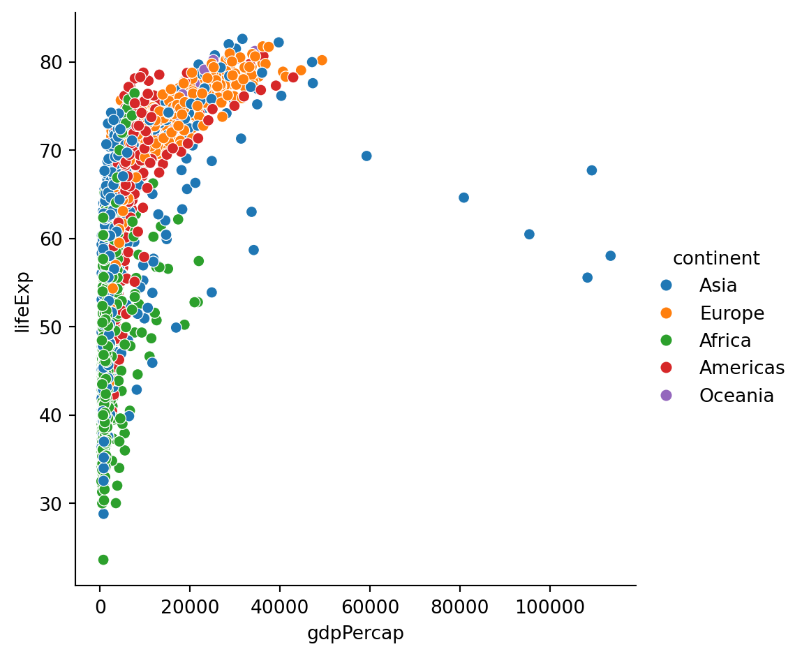
## Correlation between GDP and life expectancy
Overall correlation per continent
```{python}
#| code-fold: true
#| echo: true
# Overall scatter plot
sns.relplot(data = df, x = "gdpPercap", y = "lifeExp", hue = "continent")
```
```{python}
#| code-fold: true
#| echo: true
# Statistics

africa = df[df["continent"]=="Africa"].gdpPercap
americas = df[df["continent"]=="Americas"].gdpPercap
asia = df[df["continent"]=="Asia"].gdpPercap
europe = df[df["continent"]=="Europe"].gdpPercap
oceania = df[df["continent"]=="Oceania"].gdpPercap

print("For overall GDP per Capita:\n",stats.f_oneway(africa, americas, asia, europe, oceania))

a = df[df["continent"]=="Africa"].lifeExp
am = df[df["continent"]=="Americas"].lifeExp
asi = df[df["continent"]=="Asia"].lifeExp
eu = df[df["continent"]=="Europe"].lifeExp
o = df[df["continent"]=="Oceania"].lifeExp

print("For overall Life expectancy:\n",stats.f_oneway(a,am,asi,eu,o))
```
```{python}
#| code-fold: true
#| echo: true
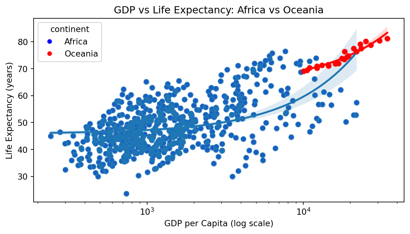
# GDP VS Life expectancy
df2 = df[df["continent"].isin(["Africa", "Oceania"])]
plt.figure(figsize=(8, 4))

sns.scatterplot(
    data=df2,
    x="gdpPercap",
    y="lifeExp",
    hue="continent",
    palette={"Africa": "blue", "Oceania": "red"}
)

sns.regplot(
    data=df2[df2["continent"] == "Africa"],
    x="gdpPercap",
    y="lifeExp",
)

sns.regplot(
    data=df2[df2["continent"] == "Oceania"],
    x="gdpPercap",
    y="lifeExp",
    color="red",
)

plt.xscale("log")
plt.xlabel("GDP per Capita (log scale)")
plt.ylabel("Life Expectancy (years)")
plt.title("GDP vs Life Expectancy: Africa vs Oceania")
```
```{python}
#| code-fold: true
#| echo: true
# Statistics for Africa and Oceania
df3 = df.loc[
    df["continent"].isin(["Africa", "Oceania"]),
    ["continent", "gdpPercap", "lifeExp"],
]
df3["gdpPercap"].cov(df3["lifeExp"])
df3["gdpPercap"].corr(df3["lifeExp"])
lm=stats.linregress(x=df3["gdpPercap"],y=df3["lifeExp"])
print("pvalue:\n",lm.pvalue)
print("\n")

df4=df3.groupby("continent")
print(df4.describe())
print("\n")

print("Correlation:\n",df4.corr())
print("\n")
print("Kendall method:\n",df4.corr(method='kendall'))
print("\n")
print("Spearman method:\n",df4.corr(method='spearman'))
print("\n")
print("Variance:\n",df4.var())
print("\n")
print("Skew:\n",df4.skew())
```
## **Inference**
The analysis concluded that Africa has a high variability in both GDP and life expectancy whereas for Oceania with its strong correlation values infers that GDP can be a good predictor of life expectancy.